
Backflip
empowering anyone to improve their life and neighborhood thorough real estate investing
www.BACKFLip.COM
ABOUT
Backflip is a proptech-meets-fintech platform that empowers real estate entrepreneurs to revitalize local communities through residential redevelopment.
CASE STUDY: IMPROVE THE LOAN PROCESS for FLIPPERS ON THE APP
Goal:
Redesign the loan application experience to make it seamless, transparent, and easy to navigate for borrowers—helping them understand exactly where they are in the process and what’s needed to move forward.
THE PROBLEM
What wasn’t working?
The original loan process lacked transparency. Users couldn’t easily see where their loan stood or what steps remained. Much of the communication was handled offline—leading to delays, confusion, and a poor user experience.
User Pain Points:
• No visibility into loan status or progress
• Difficulty getting in touch with someone for updates
• No centralized place to see active loans or where they were in the pipeline
Business Pain Points:
• Bottlenecks from manual communication
• Slower application completion times
• Increased workload on AEs and loan processors due to back-and-forth messaging
RESEARCH & INSIGHTS
We conducted qualitative interviews with existing customers to understand how they currently navigated the loan application process, where they felt friction, and what they needed most. We also spoke with internal team members—AEs, loan processors, and support—to pinpoint operational inefficiencies. To back it up, we analyzed product usage and application volume data to identify drop-off points and average submission times. The original loan application journey was highly fragmented and manual, which created friction for users and inefficiencies for internal teams. Some highlights:
High-touch, low-visibility process-
• Borrowers had to wait for an AE to reach out after submission before any clarity was provided on next steps.
• The term sheet (TS) negotiation required multiple handoffs between borrower, AE, and loan agent — often offline, with minimal transparency on progress
Manual documentation slowed things down-
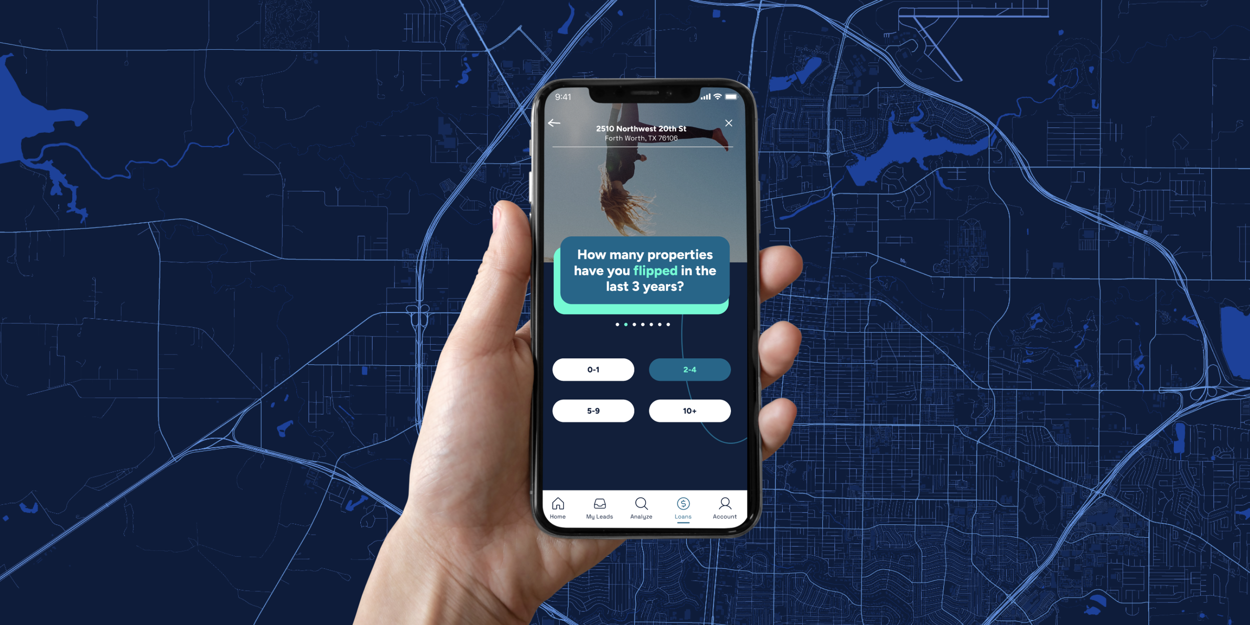
• Users were asked to fill out spreadsheets manually to provide documentation and rehab budgets.
• There was no digital system guiding them through what was needed or validating what was submitted.
Non-linear, hard-to-follow experience-
• The flow spanned many steps and roles, from PQ questions all the way to post-close rehab and repayment, without a clear centralized tracker.
• Key moments like “Draws” or “Rehab Calculations” happened in silos, often disconnected from what the borrower saw or understood.
Poor feedback loops and visibility
• Borrowers didn’t have a clear sense of where they stood in the process, what was missing, or what to expect next.
• The loan journey was mostly reactive—users were waiting for outreach, rather than being guided proactively through stages.

DESIgN PrOCESS
Early Explorations
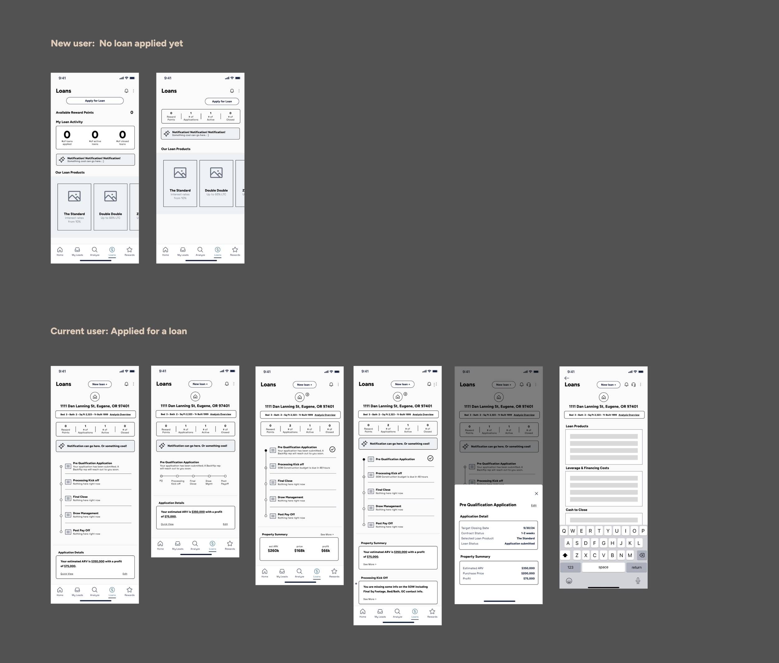
We began with low-fidelity wireframes to explore layout ideas and information architecture for the loan dashboard. These helped us quickly test concepts such as:
• A step-by-step loan tracker to bring clarity to where a borrower was in the process
• A loan snapshot area summarizing applications, active loans, and closed deals
• Integration of reward points to reinforce engagement and progress
• Clear, actionable status updates and to-dos for each loan milestone
These explorations helped us identify what information flippers cared about most and how they expected to interact with their loans.
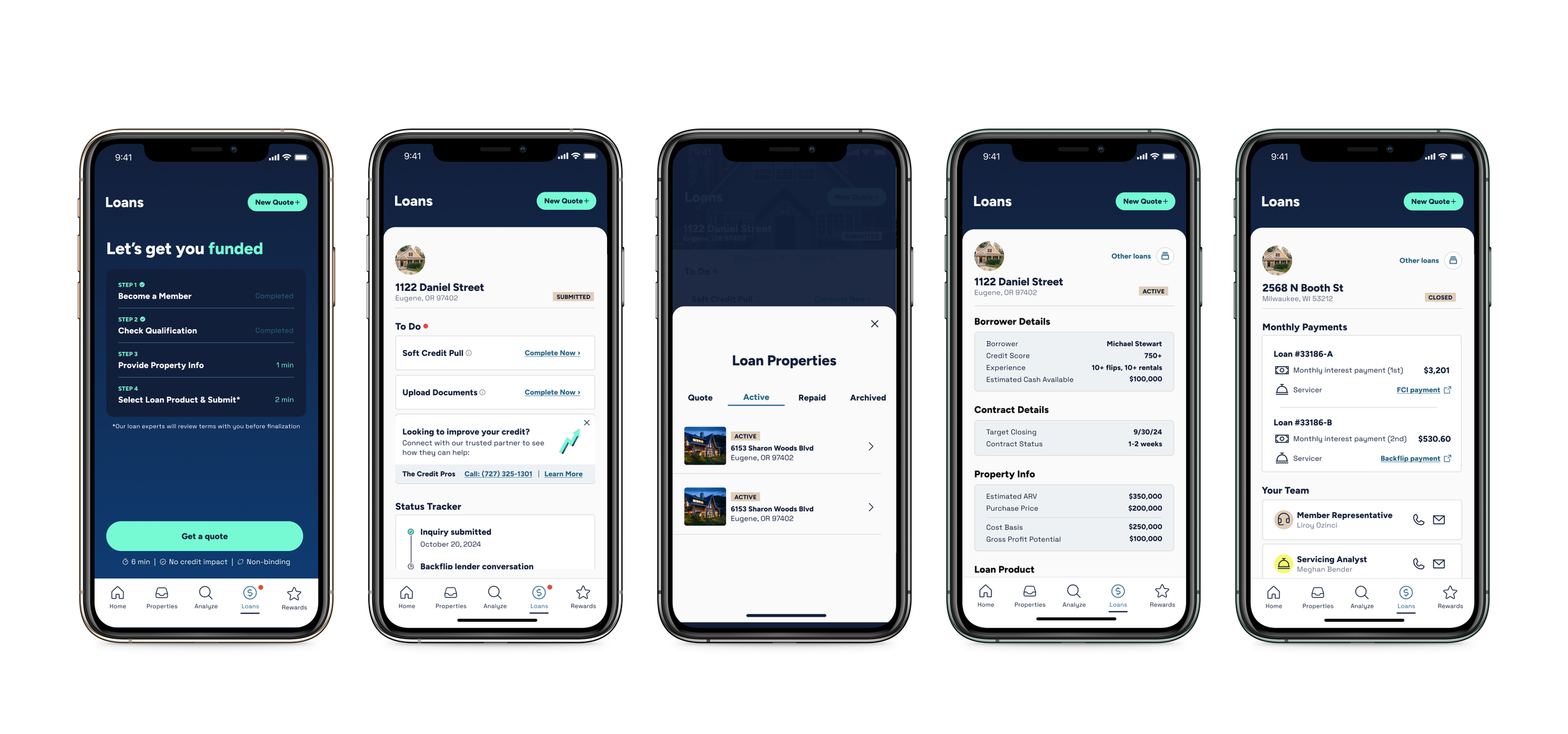
Final UI
In the final version, we emphasized usability and clarity:
• A progress tracker visualizes the exact stage of each loan
• A centralized dashboard displays loan performance, open tasks, and reward progress
• Contextual prompts and alerts ensure borrowers stay informed and proactive
• “Your Team” details highlight key contacts so flippers know who to reach out to
The result was a modern, mobile-first experience that balanced transparency, efficiency, and trust.
Impact & Results
The redesigned loan application experience was well received by both users and internal stakeholders. Flippers appreciated the increased visibility into their loan progress and the ease of understanding what was needed at each stage.
Highlights:
• Users reported feeling “more in control” of their loan process
• Internal teams saw a reduction in support requests around loan status (Weekly requests decreased by 30%)
• The new dashboard improved cross-team alignment—loan processors and AE’s had fewer back-and-forths with borrowers
• Time from application to close decreased for many users thanks to better task tracking and clearer next steps (Time for submission decreased by ~2-5 days vs ~6-7 days prior)
Reflection
This project reinforced how critical clarity and structure are in financial workflows—especially when users are juggling tight timelines and high-dollar deals.
What worked well:
• Collaborating closely with cross-functional teammates gave us a real-time pulse on bottlenecks and made problem-solving more effective
• Starting with low-fidelity concepts let us explore ideas quickly without getting stuck in the weeds of polish